Lookit Design’s new Image Resizer makes it easy to prepare clean, fast‑loading images for your website and social channels. Instead of wrestling with heavy design software, you can resize and optimize images in seconds, right from your browser.
Why Image Size Matters for Your Website
Oversized images are one of the most common reasons websites load slowly, especially on mobile connections. Large files increase page weight, which can hurt user experience, raise bounce rates, and negatively impact search engine rankings. When your images are properly sized, your pages load faster, feel smoother, and provide a more professional experience across devices.
Resizing images before upload also helps you:
- Keep layouts consistent across pages and sections
- Avoid “blown up” or blurry visuals from incorrect scaling
- Reduce bandwidth and hosting usage over time
For small businesses and content creators, having a simple way to get images “web‑ready” is a big step toward better performance and SEO.
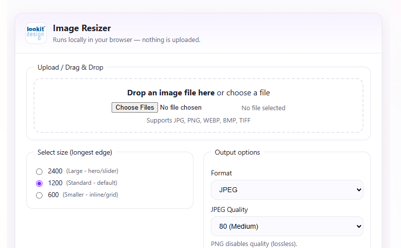
How the Image Resizer Helps You
The Lookit Design Image Resizer focuses on speed, clarity, and control so anyone on your team can prepare images correctly:
- Browser‑based tool, no installs or logins required
- Simple upload workflow with clear size controls for width/height or presets
- Output optimized for common web formats like JPG and PNG
- Designed for quick one‑off images or repeated daily use as part of your publishing flow
Whether you are preparing hero images, blog post graphics, or product photos, the tool helps you get to the right dimensions without sacrificing visual quality.
Why Lookit Design Built This Tool
Lookit Design is a full‑service creative web agency that helps brands create, maintain, and grow their online presence using proven, cloud‑based technologies. High‑quality visuals are central to that mission, but they must also be accessible, fast, and compliant. We built the Image Resizer to give clients and partners an easy way to support that balance every day.
This tool reflects how Lookit Design approaches digital projects:
- Combine design quality with technical performance and accessibility
- Provide practical utilities that support ongoing content creation, not just one‑time builds
- Reduce friction for small teams by giving them tools that “just work” in the browser
It’s a small, focused utility that fits neatly into the same workflow where we create and manage web content, images, and copy for clients
How Lookit Design Supports Your Visual Content
Beyond this Image Resizer, Lookit Design offers web content services that cover copy, images, and other media so your site feels cohesive and on‑brand. Our team helps you:
- Plan and create web‑ready visuals that look sharp on all devices
- Structure pages so images, text, and accessibility requirements work together
- Maintain performance and security while you continue to add new content over time
If you need help with a full content refresh, a new site build, or ongoing support for image and media workflows, Lookit Design can step in as your long‑term digital partner.

The Lookit® Accessibility Solution offers a powerful, branded, and fully managed approach to web accessibility. By combining the advanced technology with Lookit’s expertise and white-labeled experience, your website becomes more inclusive, compliant, and future-ready—delivering a better digital experience for everyone
